Week 12: Drawing the rest of the owl

import pandas as pd
import matplotlib.pyplot as plt
import numpy as np
import statsmodels.formula.api as smf
from matplotlib import colors as mpc
More fun with sharks
We're going to revisit the shark attacks data from last week. This week, we'll focus on analyzing and visualizing this data. This will mostly serve as a grab-bag of extra tricks and tools that might be useful (but not essential) for your projects.
Why sharks? As summarized by Vox:
Consider the curious case of New Jersey in 1916: That summer, there was a string of deadly shark attacks along the Jersey Shore. As a result, Woodrow Wilson lost his home state in the presidential election. Why, you ask? Because the beachfront towns (which rely on tourism) were negatively impacted by the attacks. Though Wilson wasn’t responsible for the hungry sharks, he was the incumbent, and people vote against incumbents when things are bad. This is a story political scientists Christopher Achen and Larry Bartels tell in Democracy for Realists, in service of a sobering thesis: Voters don’t have anything like coherent preferences. Most people pay little attention to politics; when they vote, if they vote at all, they do so irrationally and for contradictory reasons.
We'll load the data (in friendly, generic CSV format this time, but see the appendix of last week's practicum for details about using pd.read_csv() with different version of CSV/TSV files.
sharks = pd.read_csv("shark.csv")
sharks
Our dataset has 21 rows (counties), and the following columns:
- county: the name of a county in New Jersey
- wilson1912: Woodrow Wilson’s (three-party) share of the vote in 1912
- wilson1916: Woodrow Wilson’s (two-party) share of the vote in 1916
- beach: does the county have substantial beach-related tourism?
- machine: were the politics of this county run by a political machine?
- mayhew: an alternative specification of machine
- attack: was there a shark attack in this county?
- coastal: is the county located on the coast?
Additionally, we'll create another column from the wilson1912 and wilson1916 vote shares. Note that with vectorized operations, we don't need a loop, we can just subtract the two pandas Series directly:
sharks['change'] = sharks['wilson1912'] - sharks['wilson1916']
Regression modeling with statsmodels
In some cases, researchers are interested in the effect of some (explanatory) variable on another (outcome) variable, conditional on other variables (covariates). For example, what is the effect of being a beach county on support for Woodrow Wilson in 1916, conditional on whether or not the county was part of a political machine and the county's 1912 vote share for Wilson? This is the model that Achen and Bartels used when they concluded that shark attacks negatively affected Wilson's reelection prospects.
We saw how to use linear regression in DS 2000 using scikit-learn. sklearn provides a useful interface for machine learning models; in cases where you need basic statistical models like linear or logistic regression, the statsmodels may provide more useful output (and output that looks more familiar to users of, say, R or Stata, like might be used in an econometrics class). sklearn also sometimes sets defaults that, while reasonable to the machine learning practitioner, are unexpected to the social scientist (notably in the case of logistic regression).
statsmodels provides two interfaces for specifying a model formula. I'm going to focus on the one provided by statsmodels.formula because it's the same as R (portability across languages is good), and because I find the other one to be nearly incomprehensible. This involves defining a formula as a string, then using that formula in combination with a Pandas dataframe. To regress an outcome (Y) on our explanatory variable (D) and our covariates (X1, X2, ...), we define a formula like
"Y ~ D + X1 + X2"So in terms of the shark attacks example above, given a pandas DataFrame like the following:
sharks.head()
We can write our regression formula as
wilson1916 ~ beach + wilson1912 + machineAfter coming up with a model specification, we can fit the model like so:
m = smf.ols("wilson1916 ~ beach +  wilson1912 + machine", data = sharks).fit()
print(m.summary())
The model summary gives us a lot of output, most of which we won't focus on. In the middle, we have a table of model terms and their associated coefficients and standard errors. So, interpreting our explanatory variable (beach), we find that a unit change in beach (i.e., comparing a non-beach county to a beach county) is associated with a change in Wilson's 1916 vote share of -0.034. There is uncertainty around this estimate, but we are 95% confident the "true" (population) estimate is between -0.062 and -0.007; i.e., we are 95% confident being a beach county is associated with some sort of decrease in Wilson's vote share, conditional on Wilson's 1912 vote share and the presence of political machines.
We also observe in the top right the R-squared value, which we briefly touched on in DS 2000. We see that this model explains a lot of the underlying variation in the data. (This is unsurprising in the current context; most counties that vote Democrat continue to do so in the future.)
Note that not all stories require regression models. Indeed, a key contention in the literature is that regression is inappropriate for telling this story: there are few observations, the observations probably aren't indepedent, etc. Futhermore, if you want to convey answers to a general audience, telling a story using data visualization may be more appropriate. For example, considering the following visualization:
fig3, ax3 = plt.subplots(figsize=(12, 8))

beach_counties = sharks[sharks.beach==1]
nonbeach_counties = sharks[sharks.beach==0]


ax3.scatter(y=beach_counties['county'].index, x=beach_counties['wilson1912'], marker='o', color='crimson', label='1912 (beach)', s = 70)
ax3.scatter(y=beach_counties['county'].index, x=beach_counties['wilson1916'], marker='o', color='crimson', label='1916 (beach)', facecolor='none', s = 70)

ax3.scatter(y=nonbeach_counties['county'].index, x=nonbeach_counties['wilson1912'], marker='o', color='darkcyan', label='1912 (not beach)', s = 70)
ax3.scatter(y=nonbeach_counties['county'].index, x=nonbeach_counties['wilson1916'], marker='o', color='darkcyan', label='1916 (not beach)', facecolor='none', s = 70)

for idx, row in beach_counties.iterrows():
    ax3.arrow(y=idx, x=row['wilson1912'], dy=0, dx=-row['change'], length_includes_head=True, color='crimson', width=0, linewidth=1.25)
for idx, row in nonbeach_counties.iterrows():
    ax3.arrow(y=idx, x=row['wilson1912'], dy=0, dx=-row['change'], length_includes_head=True, color='darkcyan', width=0, linewidth=1.25)

ax3.set_yticks(sharks['county'].index)
ax3.set_yticklabels(sharks['county'])
ax3.set_ylabel("County")
ax3.set_xlabel("Wilson vote share")
ax3.grid(alpha=0.5)
ax3.set_title("Shift in vote shares by county")

ax3.legend();
From this visualization we can see that, although the shifts in vote shares varied a bit, in beach counties they were all negative, whereas for non-beach counties some increased and some decreased.
A visualization like this only works because we have few units under consideration (or because we are aggregating to only a few units.) With a lot of units, we would need to consider other techniques. But this example shows how we can use color and shapes to relate multiple variables to tell a story.
Mapping data
Many projects involve spatial data in some sense. A common technique in visualizing spatial data is the choropleth map, which represents the value of some variable on the map. If you have GIS/shapefile data, making these plots is not too painful with geopandas.
NOTE: this code may not run; you need to have geopandas and descartes installed.
%conda install geopandas
%conda install descartes
We'll consider the same shark attack data, using publicly available shapefile data for New Jersey.
import geopandas as gp
Geopandas behaves more or less like Pandas, but you need multiple files (.shp, .shx, etc.) to be present for gp.read_file() to work.
nj = gp.read_file("NJ/New_Jersey_Counties.shp")
nj.head()
nj is a Pandas Dataframe, like other data frames, just filled with incomprehensible (to me, at least) GIS nonsense. But, because it's just a Dataframe, it can be joined with other datasets without too much trouble. First, to make things easier, we'll rename the county variable in our sharks dataset to COUNTY to make the join a little easier. Note that both of these datasets have the county names in the same format; i.e., they both have "ATLANTIC" rather than "Atlantic" or "Atlantic County".
To rename a column, we can use the df.rename() method, which takes a dictionary where the keys are the original names of the columns, and the values are the new names we want. We also need to pass axis=1 to indicate that we want to rename the columns rather than the rows.
sharks = sharks.rename({"county": "COUNTY"}, axis=1)
sharks.head()
Now we can merge these datasets using the df.merge() method. The on parameter specifies the name of the column we want to use for the merge.
merged_data = nj.merge(sharks, on='COUNTY')
merged_data.head()
Once we have this data merged, we can use df.plot() to make a choropleth map. The parameter legend=True gives us a colorbar to aid interpretation.
fig, ax = plt.subplots(figsize = (12, 8))
merged_data.plot(column='wilson1912', ax=ax, legend=True)
fig, ax = plt.subplots(figsize = (12, 8))
merged_data.plot(column='coastal', ax=ax, legend=True)
Using color in data visualization
It's nice that we can make these plots pretty easily, but they also point to an issue with using default values, especially around color, in data visualization. df.plot() is assuming that the data being visualized is a continuously valued variable where we're just indicating more or less of something. In neither of the above cases is this really true; in the Wilson vote share example, it does indicate more Wilson vote share, but it also matters whether or not it's close to 50\%. In the coastal counties case, it's given us appropriately diverging values for 0 and 1, but they're kind of ugly.
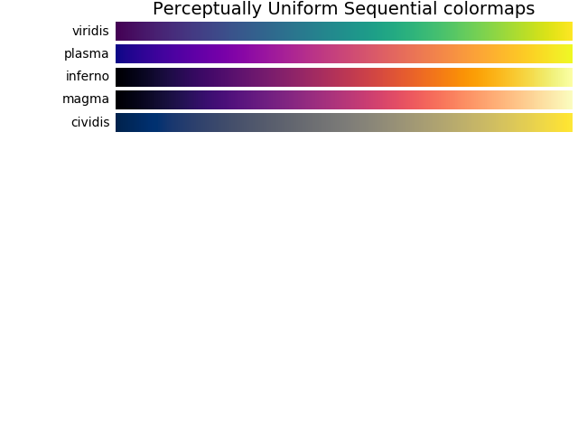
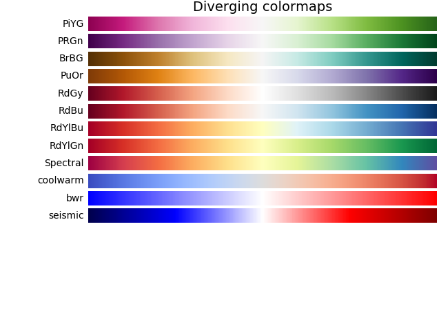
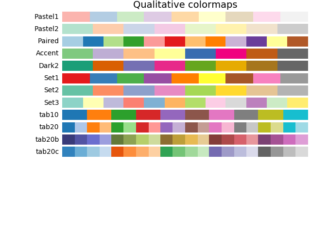
We want to use color to better tell the stories here. For this, we'll choose new colormaps for our data by varying the cmap parameter. A list of colormaps available in matplotlib by default can be found here. A key concept here is the following trichotomous classification of colormaps:
- Sequential colormaps are for when you want to indicate how much of something there is (e.g., population).
- Diverging colormaps are for when some intermediate value is of importance, and you want to indicate how much more or less there is something relative to that intermediate value (e.g., election results, where 50\% would mean a tie, less would mean Candidate A wins, and more would mean Candidate B wins).
- Qualitative colormaps are for categorical data (e.g., binary variables like coastal versus non-coastal).
I've included some of the graphical examples of colormaps below. (For the love of God, don't use Jet even for your sequential colormaps.)
We want to visualize our binary variables using qualitative colormaps and our election-related continuous variables using diverging colormaps. We also want to specify the midpoint for our diverging colormaps. To do that, we'll create a DivergingNorm, which maps our values to colors on the colormap. We know that we want vcenter, the mid-point, to be 0.5, but we also need to figure out what appropriate minimum and maximum values should be. These should probably be equally far from the midpoint, so let's look at the mins and maxs of our data for guidance.
print(min(sharks['wilson1912']), max(sharks['wilson1912']) , min(sharks['wilson1916']), max(sharks['wilson1916']) )
So, for plotting vote shares, we'll use vmin=0.3 and vmax=0.7. We could use vmin=0 and vmax=1, which are the constraints on the data (i.e., you can't win more that 100\% of the vote), but these values will squash all the colors close the midpoint, and create a misleading impression; winning 70\% of a county is a very decisive victory.
So, making a very large plot summarizing lots of these variables, we can combine our new geopandas-based chloropleth maps with other things we have learned about visualizing data with matplotlib. We can make some subplots, plot each map on a different axis, remove the (unhelpful in this case) axis labels, and set titles. In our case, it's clear from context which value is associate with the gray color and which is associated with the green color; if we didn't, we would need to come up with some way of conveying that.
fig, axes = plt.subplots(figsize=(16, 12), nrows=2, ncols=4)
((ax1, ax2, ax3, ax4), (ax5, ax6, ax7, ax8)) = axes

norm1 = mpc.DivergingNorm(vmin=0.3, vcenter=0.5, vmax=0.7)
norm2 = mpc.DivergingNorm(vmin=-0.1, vcenter=0, vmax=0.1)

merged_data.plot(column='wilson1912', ax=ax1, cmap = 'bwr', legend=True, norm=norm1, edgecolor='black', linewidth=0.3)
merged_data.plot(column='wilson1916', ax=ax2, cmap = 'bwr', legend=True, norm=norm1, edgecolor='black', linewidth=0.3)
merged_data.plot(column='change', ax=ax3, cmap = 'bwr', legend=True, norm=norm2, edgecolor='black', linewidth=0.3)

merged_data.plot(column='attack', ax=ax4, cmap = 'Accent', edgecolor='black', linewidth=0.3)
merged_data.plot(column='beach', ax=ax5, cmap = 'Accent', edgecolor='black', linewidth=0.3)
merged_data.plot(column='coastal', ax=ax6, cmap = 'Accent', edgecolor='black', linewidth=0.3)
merged_data.plot(column='machine', ax=ax7, cmap = 'Accent', edgecolor='black', linewidth=0.3)
merged_data.plot(column='mayhew', ax=ax8, cmap='Accent', edgecolor='black', linewidth=0.3)

ax1.set_title("Wilson 1912 vote share")
ax2.set_title("Wilson 1916 vote share")
ax3.set_title("Change in Wilson vote share")
ax4.set_title("Locations of shark attacks")
ax5.set_title("Beach counties")
ax6.set_title("Coastal counties")
ax7.set_title("Political machines")
ax8.set_title("Political machines (alt. specification)")
#fig.colorbar(plt1, ax=ax1)
for row in axes:
    for ax in row:
        ax.set_xticks([])
        ax.set_yticks([])
Appendix: Colormaps
Appendix II: The Discourse about Shark Attacks
Links are clickable, going to the source documents.

